Data Visualization Portfolio for Class
Welcome to Data Visualization Portfolio for Class
Welcome to my class blog, Data Visualization Portfolio for Class. I hope you enjoy!
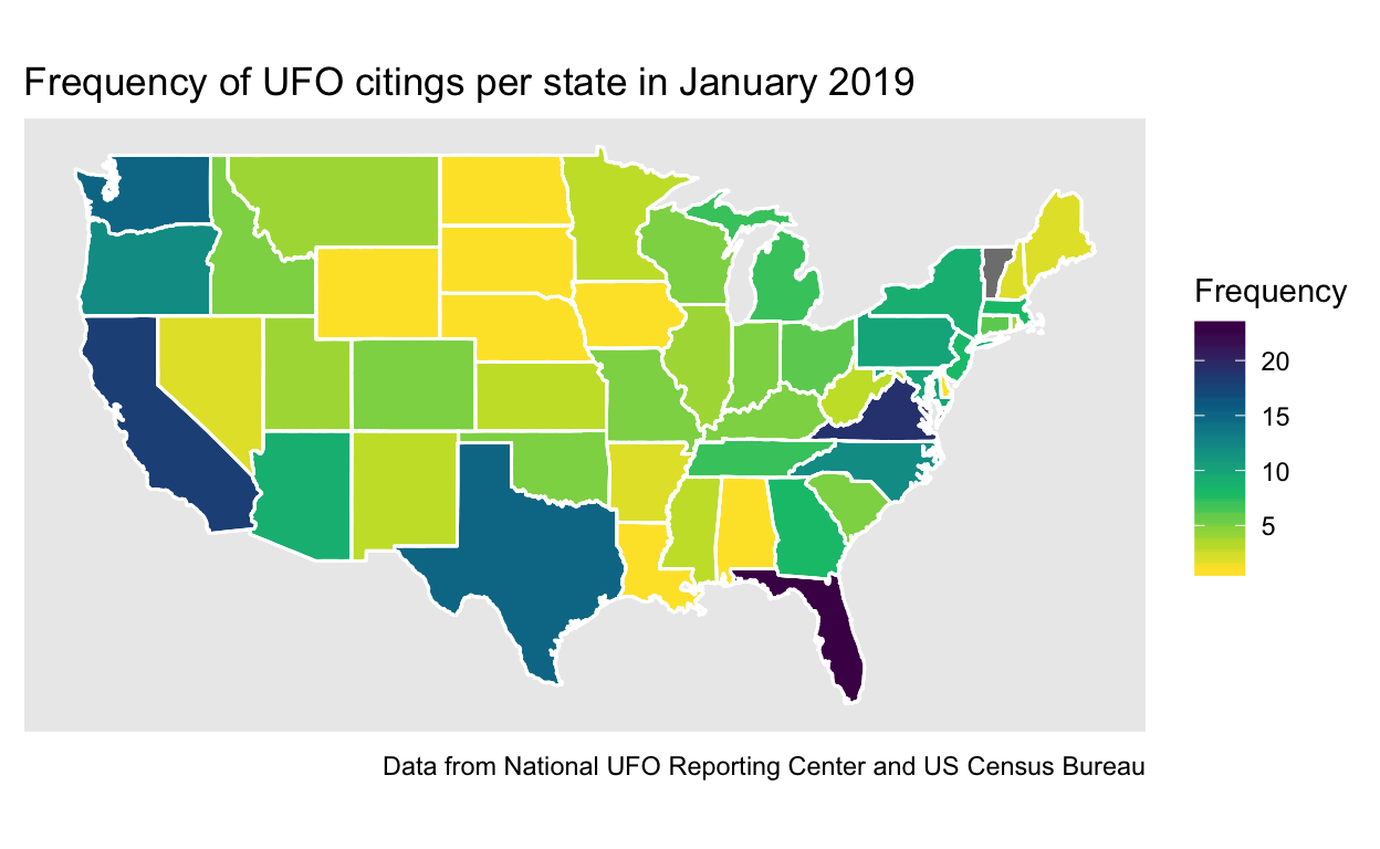
Data Visualization 1: The Before version
This is the original version of Data visualization 1, before undergoing peer review and edits. There are two plots, one that shows frequency and the other that shows proportion.
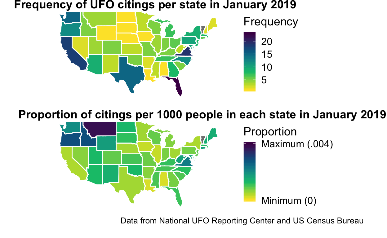
Data Visualization 1: The After Version
The final version of Data Visualization 1, which combined the two separate plots into one and made a few other minor changes.
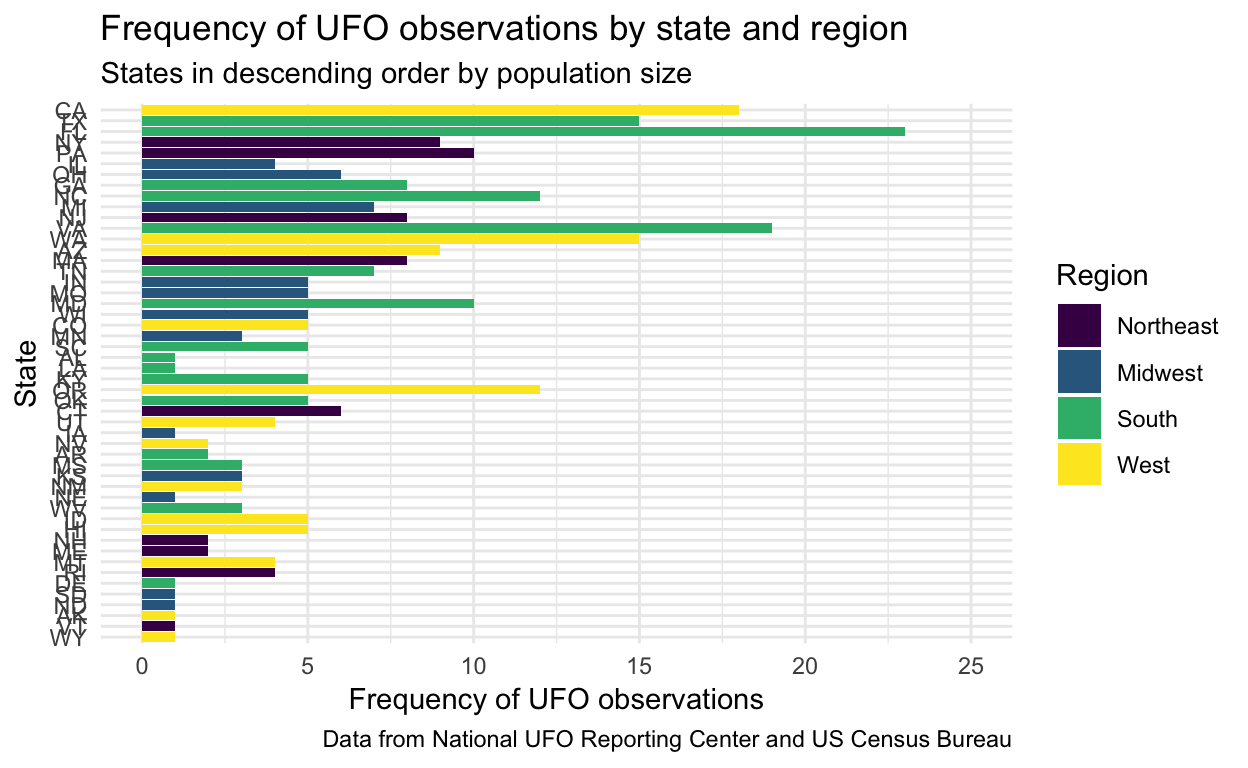
Data Visualization 2: The Before Version
This visualization displays the data from the first visualization differently by using a barplot and filling the bars with the region in which the state is located.
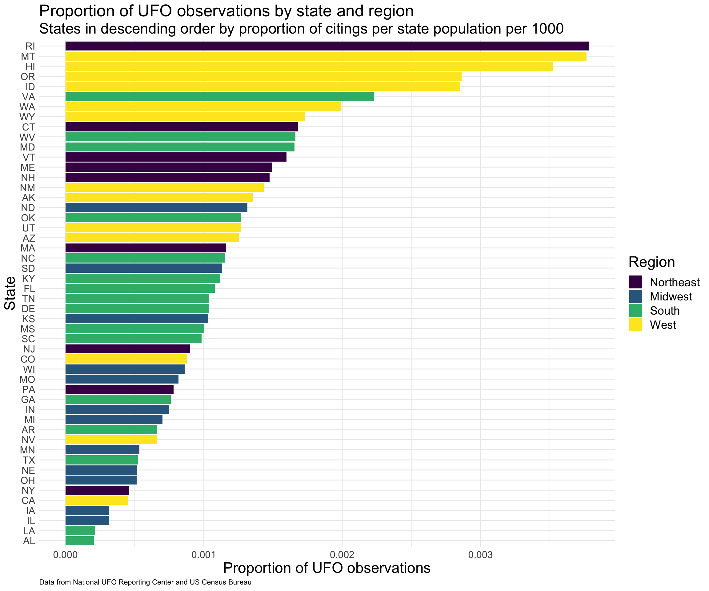
Data Visualization 2: The After Version
The updated version of this plot shows that the highest proportion of UFO citings generally occur in Western states, but that Rhode Island takes the number 1 spot!
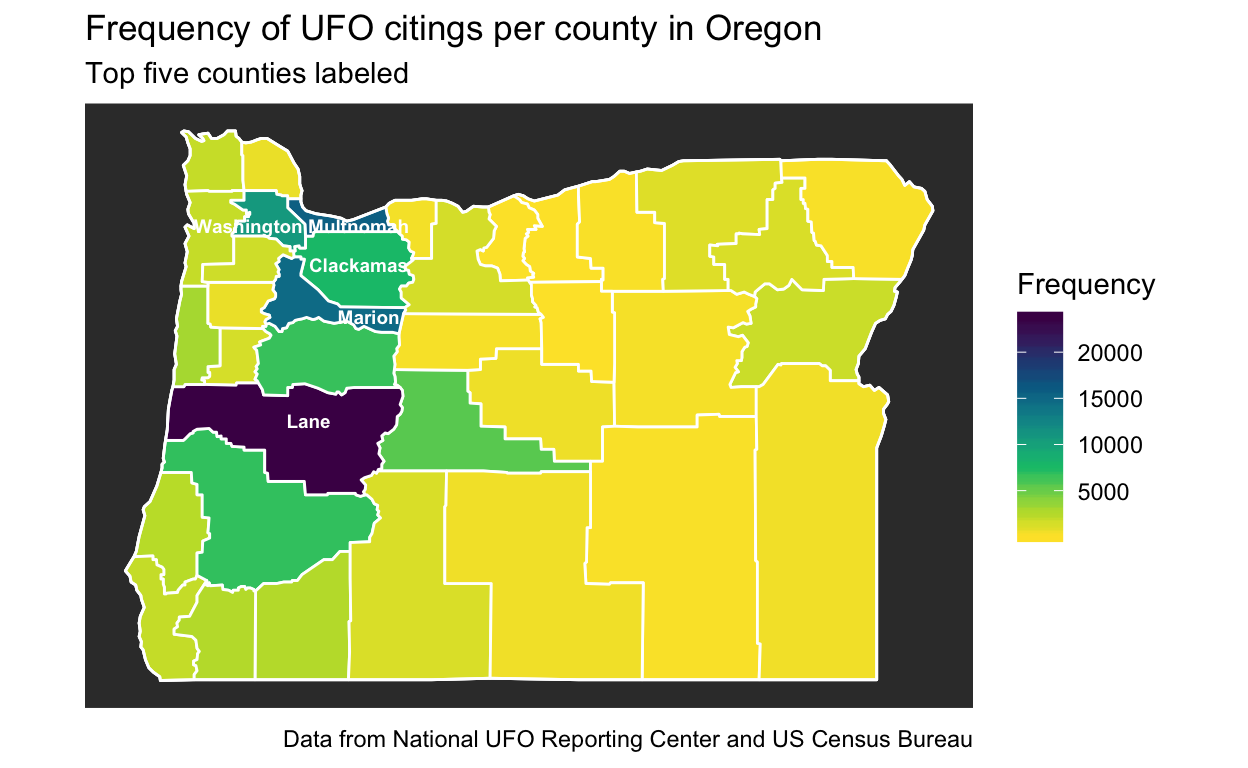
Data Visualization 3: The Before Version
These visualizations show the UFO observations per county in Oregon since 1905, with the second plot taking into accounty population size per county.
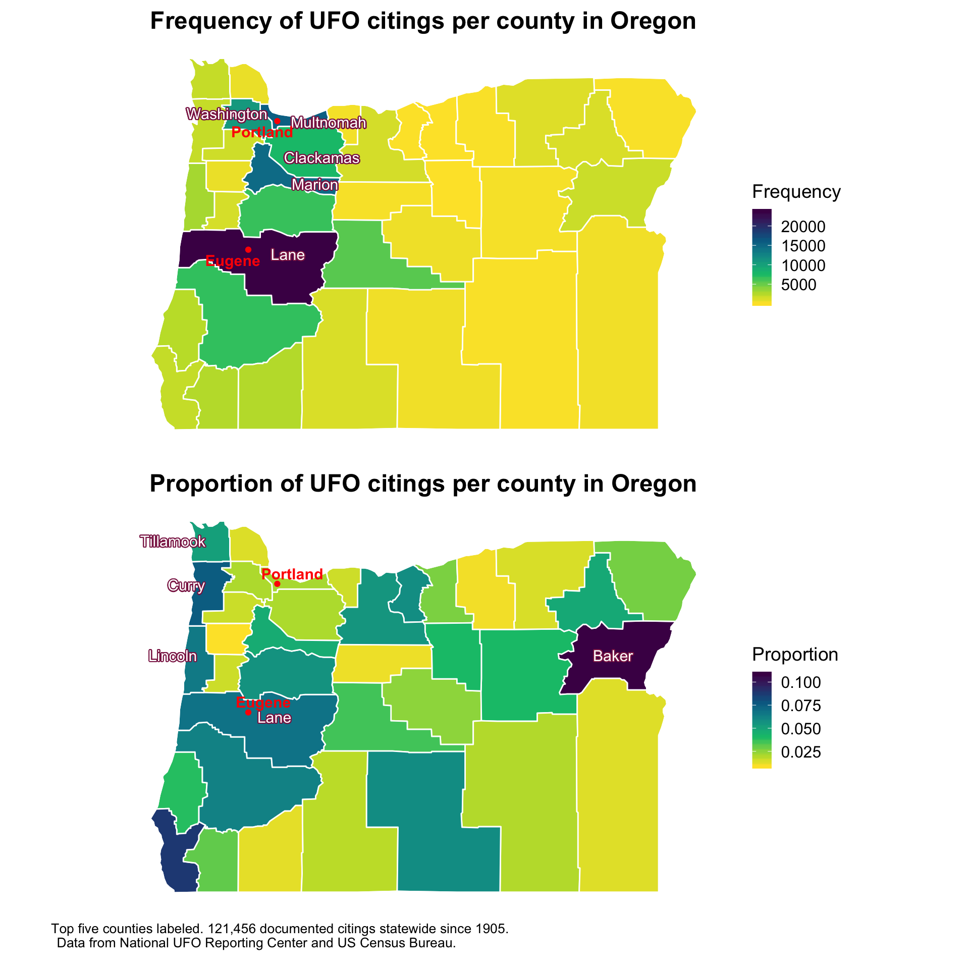
Data Visualization 3: The After Version
This plot updates the third data visualization by combining the two plots of Oregon into one and making it easier to read the text labels.